
Sephora
- User research
- Ideation, wireframe, prototyping
- UI/UX Design
This is an individual side project for Sephora mobile app improvent.
I encountered some experience issues when I used Sephora App, so I came up the idea to conduct this design challenge. I interviewed my friends who are Sephora App users; read App reviews; identified and designed for 3 problems.
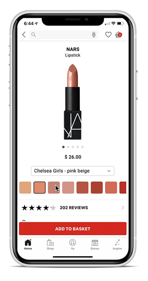
Improve color selection interaction
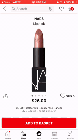
Have to click through squares of color to find the name.
This is the most complaints from App Store reviews and my friends.
Girls are not satisfied with the color selection process:
Problems
-
Can not directly choose the color by name. The color name appears only when click the color box. So the user have to click through the boxes to find a specific name.
-
Color name is hard to read. The text of color name is too small to read.
-
Color boxes and swatch images are not in the same screen. Users have to scroll down to the bottom to choose the color, then scroll up to see the swatch image.
Ideation


Solution

Easier purchase decision-making process
Solution 1. Leave notes on product page

Solution 2. Leave notes on Shopping List which combined History & Favorites

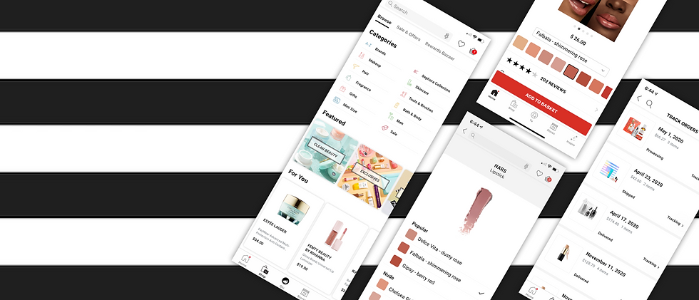
UI Improvement
1. Shopping-Browse page

2. Track Order page
